
When I attended college for web development and design, responsive design was merely an idea that was gaining traction at a rapid pace. If you wanted a website to be tailored to a mobile device, more than likely it was a separate URL using a framework like jQuery mobile (this is still an option, but not necessarily the right option). With the increase in smartphone usage over the next few years (not to mention coinciding new technologies like HTML5 and CSS3), responsive design would no longer be just a cool experiment but a standard in web design and development. With that standard comes seemingly endless techniques and frameworks to rapidly build a mobile-friendly website.
All Hail The Great & Powerful Google
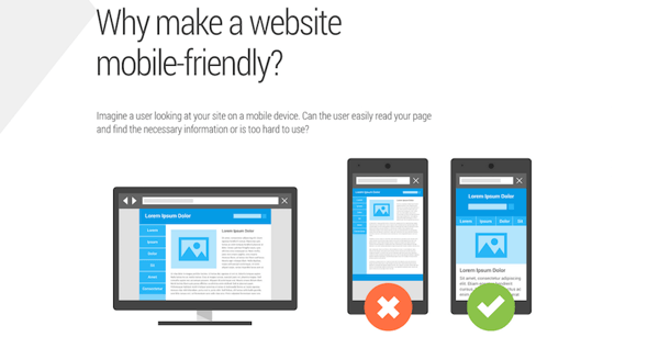
With Google's recent algorithm update for mobile search, commonly referred to as Mobilegeddon, the standard has been made more concrete. Websites that fail the test suffer a lower ranking for mobile searches. Google's mobile-friendly test and their handy PageSpeed Insights tool allow you to understand how your website is doing on the mobile front.
Google outlines 3 ways to build a mobile-accessible website (responsive being their preferred method):
- Responsive design: content and layout change based on device width
- Adaptive design, or dynamic serving: serve up different content based on user agent (device browser) dynamically
- Dedicated mobile site: separate URL for desktop and mobile (as mentioned above)
Let's See Some Numbers
Each method has its advantages and disadvantages, but regardless of the method chosen, being accessible to all devices large and small unquestionably increases overall conversions. But, don't just take my word for it:
eConsultancy compiled 14 brands that increased conversion rates via responsive design back in 2013, and the data speaks for itself. For example, State Farm increased overall conversion rates by 56% as a result of having a responsive and adaptive mobile deign. ConversionXL also made a strong case for mobile-friendliness, highlighting more success stories where conversions, transactions and revenue all were on the increase due to mobile optimizations. After implementing responsive design, they found that revenues for O’Neill Clothing increased by 101.25% for iPhone/iPod users, and 591.42% for Android users. Yes, you’re reading those numbers correctly.
When considering optimizing content for a mobile experience – regardless of the method used – here are a few tips:
- Keep content clean and precise without the bloat – consider the user experience for desktop vs a phone or tablet.
- Make sure calls to action are apparent and clearly visible.
- Shave any excess fields in online forms to a minimum.
- Keep pertinent info above the fold and minimal.
- Headings and body text should be large enough to read.
"Less is more"
Now What?
So, let's say you've boosted your overall score according to Google for mobile (and desktop). Let's also assume you've done A/B testing to see what content converts and what doesn't. That deserves 
all around, but let's take a step forward and consider another way mobile conversion rates can be influenced: page speed.
Does page speed actually impact mobile conversion rates? Of course! Check out how page speed impacts mobile users for this sporting goods site:
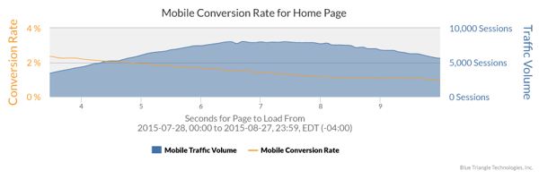
Conversion rates were 2.29% at a 3 second page load, and 1.1% at an 8 second page load.
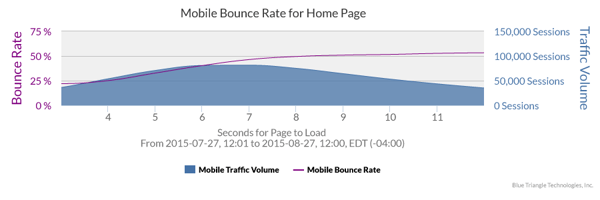
Bounce rates increased 24.4% between a 4 second page load and an 8 second page load.
Clearly, page speed impacts conversion for mobile users. It’s important that you understand where you need to speed up your site, and which users need to be sped up to best support increases in conversions and overall revenue. Our Real User Monitoring can help.

During the holiday rush, every shopper matters
Optimize the customer journey before the eCommerce event of the year.