Part 1 of Blue Triangle’s Accelerator Series: Best Practices to Improve Web Performance
As you look for ways to improve web performance, optimizing images should be one of your top priorities.
Why? Because 39% of visitors will stop engaging with a site if images won't load or take too long to load.
Images are critical to delivering a frictionless user experience but can come at a high cost to your site's speed if not properly optimized.
The number of image bytes loaded on a web page has increased by 279% for desktop and 1017% for mobile since 2011. Across the millions of URLs crawled by HTTP Archive, images are responsible for 33% of a desktop page’s weight, and 39% of a mobile page’s weight.
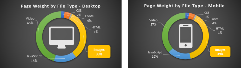
And when Blue Triangle analyzed just the Top 1000 eCommerce websites, we found that images accounted for 67% of page weight.
Additionally, images place a greater demand on browser resources for mobile users than for desktop users. Considering 55% of all online shopping in 2018 occurred on mobile, image optimization is critical.
Images aren’t going anywhere so don’t let them slow down your website. Here’s why you should care:
- A report by Adobe in 2015 determined that 39% of users stop engaging with a site when images load slowly.
- Search engine algorithms, especially Google's, consider site speed a ranking factor.
- Page load time directly impacts sales and conversions.
In a case study we did with US Auto Parts, the retailer made millions just from improving the speed of 2 of their web pages.
As you go through the process of optimizing your images, keep in mind your end goal is to increase conversion rates by providing the best experience for your users. That may mean increasing the number of images or the resolution of your images, so continually test to find the "sweet spot".
How can you optimize images and speed up your site?
Less data and fewer requests lead to faster page loads.
On average, one pixel downloaded is equal to 3 bytes of data, which adds up quickly. An HD lossless JPEG uses over 3 MB of data. When you consider that total image transfer size per page is 0.9 MB, it becomes obvious that reducing image size is essential. Additionally, each file requested adds to the time it takes to build a webpage due to additive round trip time (RTT).
At this point, it becomes a question of math and ingenuity. To serve up less data and fewer files, you have to build your page using less data and fewer files.
To do this, you can:
- Reduce the number of images
- Remove them
- Concatenate images into single files (i.e., image sprites)
- Load critical images first
- Prioritize above-the-fold content
- Lazy load non-critical images only when needed, or after critical images
- Cache static images to reduce redundant requests
- Compress and reduce image data as much as possible without compromising acceptable quality.
Tip 1: Reduce the number of images
If images don’t add value, they’re adding unnecessary complexity, and can become a distraction.
Research by Google in 2016 found that on mobile, converted sessions had 38% fewer images downloaded than unconverted sessions.
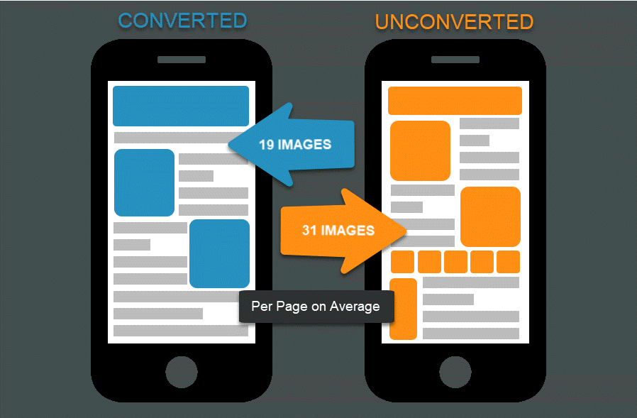
Part of the reason that more images can lead to fewer conversions is due to image bloat – unnecessary favicons, thumbnails, product images, and logos – which can slow down a page without adding value. Try replacing images with CSS styling where possible to reduce some of this bloat and cut down on any redundancies.
Once you get rid of redundant and unnecessary images, you can lower the number of images even further with CSS sprites. Think about icons on Google. Google’s UX is clean, but many of the navigation icons that Google uses load in a single CSS sprite.
Google's CSS Sprite
Concatenating static images into single sprite files can reduce the total number of requests on a page and allow easier caching. While the number of requests might not matter as much with HTTP/2 due to multithreading, it could still help, depending on your site.
How Do You Create CSS Sprites?
One technique is manually placing smaller images beside each other and combining them into a single file. You'll then be required to create CSS code to add to your website, which involves setting CSS properties such as background image, background-position, and image width and height. Rinse and repeat this process for every sprite image needed for your web optimization project.
Creating and maintaining CSS sprites and trying to keep track of all the different properties can be frustrating and a large undertaking. So, if you're thinking, "Gee, I don't have the time or dev resources to do that. There must be an easier way," then you're not alone.
There are several tools and free online services that you can use to help, like the CSS Sprites Generator developed by Toptal. This tool simplifies the complex effort of creating CSS sprites by providing an interface where you can upload multiple images, set their positions and dimensions, and automatically generate the combined CSS sprite image and the corresponding CSS code.
Remember: Always test before implementing, and keep in mind that concatenating images can increase total file size, so if changes are made frequently to the file, any performance gain will likely be lost.
Tip 2: Load critical images first
Sites often load content below the fold before above-the-fold content. Hero images can get deprioritized in favor of scrolling carousels with thumbnails that are offscreen. These images aren’t initially seen by the end-user yet can impact page performance.
So instead of loading non-critical images first, prioritize critical content. Hero images, navigation icons, and product images can all be considered critical since the user depends on them to make a buying decision.

Another way to reduce image bloat on the page is through lazy loading images that are offscreen and below the fold.
Lazy loading uses JavaScript to keep the page from requesting files that the user doesn’t see. Loading only images the user can see requires less data than loading the full page every time.
One tradeoff is that the standard implementation of lazy loading causes the images to start downloading only when the user scrolls to that spot on the page. You can work around this by automatically loading files below-the-fold and offscreen once critical images download.
Remember the Google navigation icon sprite from earlier? What if you cached that file locally so that successive loads of Google’s search pages wouldn’t make you download the file every time you visit another page? Client-side caching can be an effective tool for faster response time, but it should be used judiciously. Changes to a file make it necessary to re-download the file, and browsers have limitations on data storage.
Tip 3: Compress and reduce image data
Acceptable quality of images will vary by site. However, there are some best practices that aim to make for better user experiences.
- Choose the right file format for the image type
- Get rid of metadata and compress images
- Resize images for the end-user
- Make sure the image still looks good
Choose the right file format for the image type
Choosing the right file format depends on your visual requirements and desired performance. Should the image be photorealistic? Scale to any size? Is part of it transparent? Here’s a quick look at the main characteristics of some common image formats.
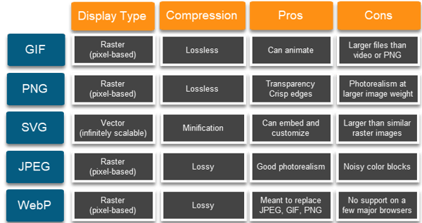
More can be said about image formats, but in general, you want to use:
- SVG where scalability and responsive design are important
- PNG for transparency, logos, and icons
- JPEG for images requiring photorealism
While WebP might gain broader support in the future, particularly on mobile browsers, make sure every user who comes to your site can see the images as a baseline. That can even mean using WebP and gracefully degrading to a different image format.
Get rid of metadata and compress images
All of these image formats can be compressed (except for SVG, which can be minified and stripped of metadata). To determine image quality levels, consider running an A/B test to see what kinds of image configurations drive higher engagement and conversions.
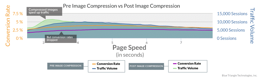
Running an A/B test is important because sometimes over-compression of images can hurt conversions. Here’s an A/B test Blue Triangle measured for a clothing retailer, where conversion rates dropped as a result of too much compression.
Resize images for your end-user
Resizing images can be the most difficult because it ties in with image compression. Display pixels versus CSS pixels come into play on different kinds of displays. In general, you want to deliver an image that most closely matches the end user’s display size. Why? Think about these two scenarios:
- A picture is blurry on a 4K TV display
- Only half of a picture can be seen on a mobile phone because the other part is hidden offscreen
Delivering an image sized appropriately for the window is one of the easiest ways to reduce processing time, and scaling images down reduces both overhead and the total number of pixels necessary to render the image.
Delivering an inappropriately sized image makes the browser first decode the image, which is necessary for all image rendering. Then the browser must resize. Resizing the image is an extra step that adds to the total time until a user can see the image. Currently, the most widely-used way to resize is using the HTML5 and CSS3 language, in particular <picture> and <img srcset=””> tags.
Make sure the image still looks “good”
All of these best practices should be done while keeping the functional piece of the image in mind.
What is the image going to be used for?
Depending on why the image is being served to the page, there will be different levels of acceptable quality.
When does a user want an image to look good?
For high-resolution, detailed pictures, you may need to deliver slightly larger files. Contrast that with a product thumbnail, which shows a smaller view. These can likely be compressed even further.
Takeaways and the TL;DR
Image optimization can be an overwhelming concept. I’ve focused this blog post around the performance of images – without much consideration for aesthetics, UX, or more nuanced discussions of browser rendering. Keep in mind best practices and optimizations change as the environment of the Internet changes, and the Internet changes continually.
Because of its complexity, the last consideration is automating image optimization for your site or organization. There are a host of tools, sites, and products aimed at making this process easier. In fact, many content delivery networks (CDNs) now have their own image optimization tools.
And finally, here’s the TL;DR.
TL;DR: Image optimization best practices
- Remove any images that add no value.
- Consider reducing the number of image files with CSS sprites.
- Prioritize critical images, and above-the-fold images.
- Lazy load the rest.
- Cache images where it makes sense.
- Choose the right file format for the right image type.
- Compress images to acceptable quality levels.
- Resize images to reduce browser processing.
- Automate the process if you can.
- Test changes before you make them.
- Aim for consistent experiences between devices.
- A/B test to determine what is best image quality level for your users.
And if you run an A/B test, you can use Blue Triangle’s real user monitoring to see the performance and revenue outcomes of different scenarios. Happy optimizing!
Further reading
These guides from Google developers go into even more detail and have links to relevant tools:
This one is from Kinsta, also with links to relevant tools:
A great article about the pros and cons of different image formats:

During the holiday rush, every shopper matters
Optimize the customer journey before the eCommerce event of the year.